Deep-Dive Statistical Analysis
Comprehensive quantitative analysis of 18+ years of backtested performance
Important Disclaimer
Past performance is not indicative of future results. All data represents historical backtesting on simulated trades, not actual trading results. Trading involves substantial risk of loss.
Statistical Distribution Analysis
Understanding the shape and characteristics of return distributions
Violin Plot - Return Distributions
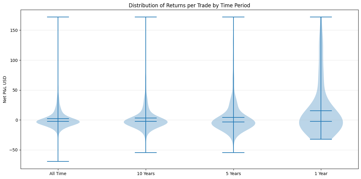
Violin plots show the probability density of returns at different values. Wider areas indicate more trades at that profit/loss level. Compare how distribution shapes change across time periods.
Q-Q Plot - Normality Test
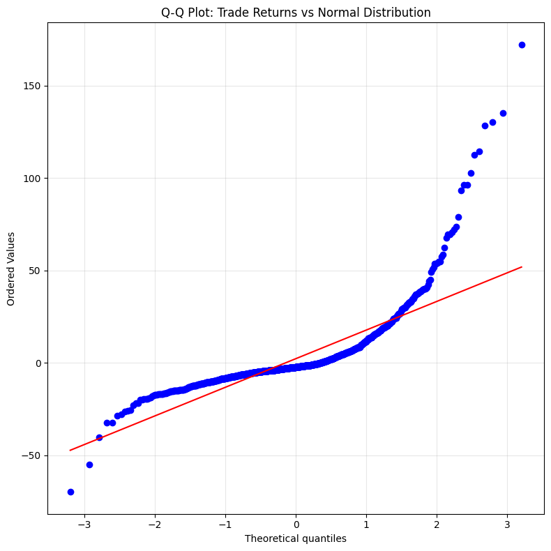
This plot tests if returns follow a normal distribution. Points on the diagonal line = normal. Deviations show skew and fat tails. Our strategy shows positive skew (more large wins than large losses).
Cumulative Distribution Function
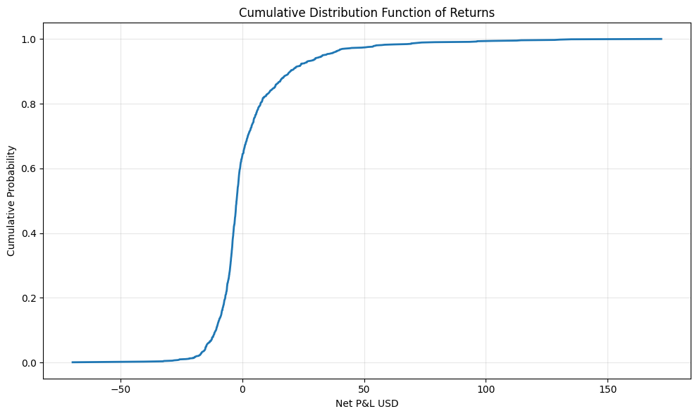
The CDF shows what percentage of trades were below a given P&L level. The steeper the curve around zero, the more consistent the results. Flat areas indicate rare outlier trades.
Risk Analysis
Correlation analysis and trade categorization
Rolling Correlation with Gold
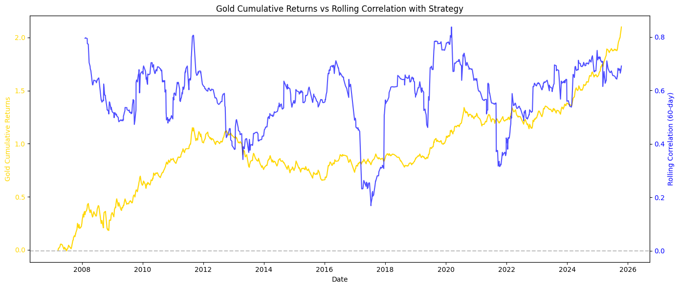
This shows how closely the strategy's returns correlate with gold's price movements over time. Lower correlation means the strategy adds value beyond just buying gold.
Treemap - Trade Size Categories
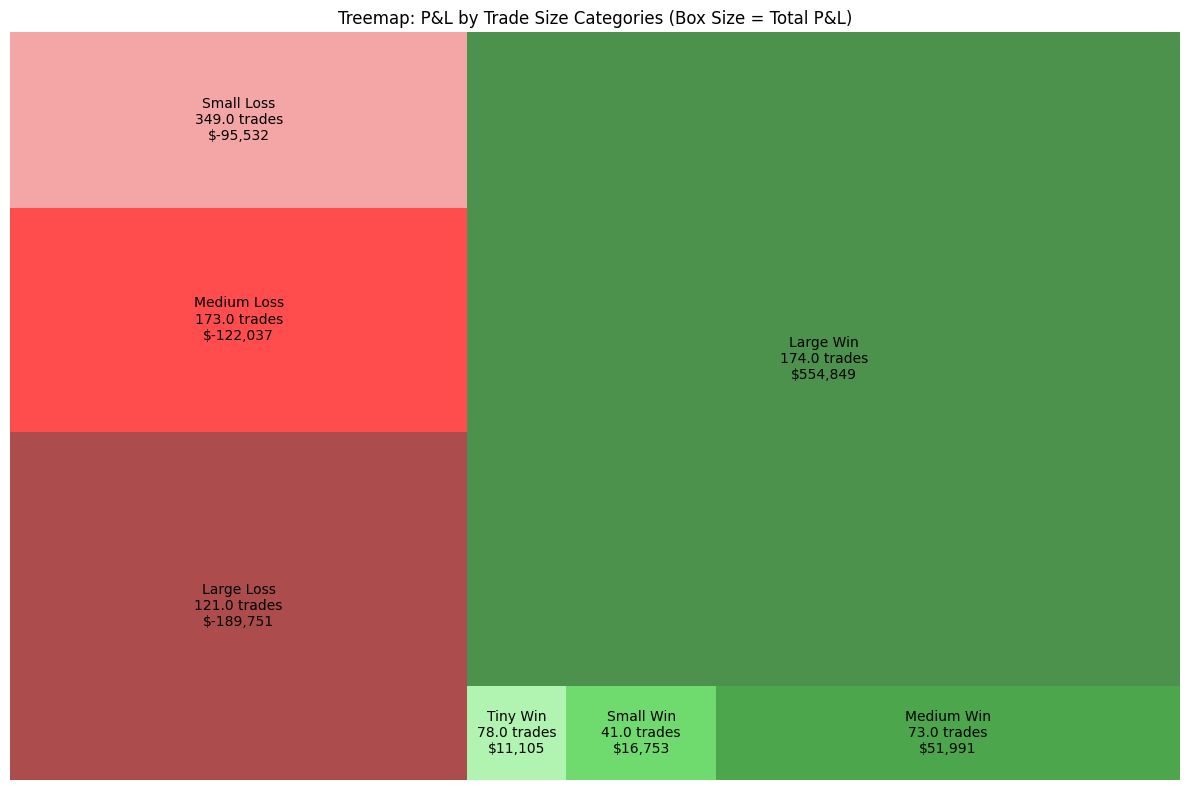
Trade results grouped by size (Large Win, Medium Win, Small Win, etc.). Box size represents total P&L contribution. Shows which trade types contribute most to overall performance.
Time-Based Analysis
Efficiency metrics by trading hours
P&L Per Hour by Day of Week
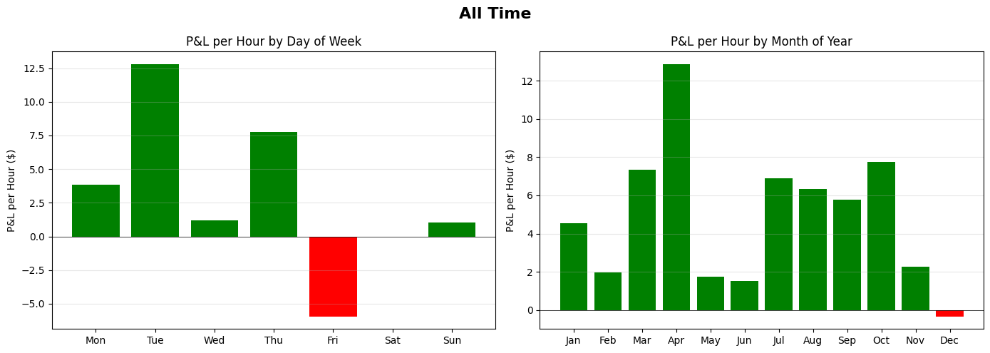
Not all trading hours are equal. This shows profitability normalized by hours spent in trades for each day. Helps identify most efficient trading days.
Ready to Apply These Insights?
Learn the methodology behind these metrics and start trading with statistical confidence.